A few years ago, I managed a user-experience designer who excelled at design but was wholly unfamiliar with the user end of cybersecurity software. It mystified him why I would overrule a straightforward aesthetic decision in favor of something less beautiful because it “preserved cognition.” So I signed him up for a trip to sit among the people who spend long days staring across a dense constellation of screens, each one illuminating feeds of recent alerts from various cybersecurity products. The situation went catastrophically wrong but we all learned a lot.
In case you’re unfamiliar with the market, these cybersecurity tools were not what your parents might install on a Windows laptop. That’s Consumer-grade tech versus what the industry calls Enterprise-scale cybersecurity for small to medium businesses and major international organizations. In 2020, Enterprise cybersecurity was thought to have total revenues around $133B according to Gartner, a number that could triple by 2028. These tools are expensive because they are complex and rich with information and frankly awesome, and because the price of not leveraging them can be enormous.
The cybersecurity industry came late to embracing UX. Some say that, unlike Google and other tech leaders, it still hasn’t. I was lucky enough to have spent almost 20 years in Enterprise cybersecurity making the case for a strong UX practise. I had a deep technical background—with tens of patents awarded in the field—alongside a range of creative skills—winning major industry awards for books and games I’d designed. Most crucially, I’d learned how the tools our industry expensively builds and expensively sells are capable of failing our customers in expensive ways. It ends up having little connection to how much the products cost to buy, and everything to do with how much—or rather what resource—the products cost to use.
What I’m talking about is not time or money. It’s cognition, and every person’s limited allotment of it may be our most critical cybersecurity resource. Today we’ll look at why, and what can be done.
The Problem
Customers can’t extract the full value of Enterprise cybersecurity tools unless the user experience is baked into the development. Too often, product development starts with the visual presentation, mocking up what looks good and what could go where; or alternately, a designer is brought in near the end of development to make things look pretty. Meanwhile, the people who actually manage these tools are tasked with a job that is cognitively, well, unusual, and nice presentation alone won’t help them. They spend thankless days poring over low-level alerts from the usual suspects, silencing bursts of irritating false positives while being ever vigilant for the rare Hollywood-style cyber-trouble. As boring as it may seem, reading these digital tea leaves is not for the faint of heart.
New to cybersecurity, our designer did not understand this dull but crucial work. Consequently, his training in clean, calm visual presentation often taxed the cognition of users, making it harder to extract value from the product.
Here’s an example of efficiency from a UX standpoint. Sometimes we expose long strings of “garbage” letters and numbers stacked row after row in table cells. The designer naturally hid them in “hover over” pop-ups to tidy the screens. Clean means more efficient, right?
It was not. Analysts often depend on those squiggly messes. Sadly for white space, it can be crucial to quickly scan an unreadable mess—What if all the garbage values are the same, or all but three are different? Having spent time on customer sites, I knew the efficiency of exposing “garbage” sometimes, even if it’s ugly.
Even though machine learning has reduced the importance for certain kinds of complexity to be exposed as prominently as we did several years ago, the practise still has some use. Humans can still be quite valuable pattern-detectors.
Using colour
UX problems also arise when designers are not allowed to focus on the user’s sense of visual hierarchy. One example is the use of colour. In designing the user experience of cybersecurity products, colour must be reserved to direct human attention; no colour is more important in this context than red. Across several organizations, I’ve gone to the mat to use red in our user interfaces only for critical problems.
Red has always been of primary importance to human minds. When your friend suddenly has a wet splash of red on them where they didn’t a moment ago, humans have historically found it alarming. Across literature in every language, red is the first color to be named. (“…red is always first and blue is always last.” Why Isn’t the Sky Blue; Radiolab, 2012.)
As someone who worked for a company whose logo was itself red, I spent years cajoling some unhappy marketing people to create a black version of our logo for our products to use on screen. For the people whose job is to respond to red things, filling the top fifth of the screen with red corporate branding can slow their response time. They could overlook the alert entirely. Often by the time a critical alert pops up on your screen, it’s too late. The horse has left the barn, and the barn is on fire. Still, acting within minutes could mean the difference between a quiet afternoon and a corporation-altering disaster, as we will see.
Context switching
UX problems also arise when designers burden users with unnecessary context-switching. Researchers at the University of Notre Dame ran a study where people stood at a table on one side of a long room and arranged some elements. Then they walked across the room to complete the task at another table. They did well until the researchers partitioned the room, leaving a doorway between. After that, completion rates plummeted.
The study invoked that common human experience of walking to another room to get something and forgetting what it was upon arrival. You didn’t lose your mind; you gained a partition, and an additional context to inhabit.
The researchers proposed that our physical location defines the larger context in which our minds operate. As we change locations, our minds dehydrate our previous context to focus instead on our new context. You leave your living room to make popcorn, and the moment you cross the kitchen’s threshold you forget why you’d gone in there. Walk back to the living room and your mind rehydrates that context, and you remember, popcorn!
Here’s where it gets weird. The researchers repeated the study but had subjects sit in front of computers controlling a human figure on screen. In a long virtual room with a table at each end, people did okay, but when the researchers placed a virtual partition in the virtual space, completion rates tanked again.
A cybersecurity system with a rich range of functionality can certainly look complicated; often they’re designed from a simplistic perspective, with one table on each screen—essentially one view for a table of settings, another for a table of security events. Although this approach may make a developer’s life easier and appear efficient, navigating these individual contexts with a virtual wall between them takes a serious toll on the minds of cybersecurity professionals. Reviewing those security events and repeatedly checking them against the bundle of settings is like walking from kitchen to living room, trying to remember the popcorn. And assume you’d have to drill down into yet another view to see the details of each event.
Unfortunately, the designer I managed would see the results of that problem first-hand. I sent him off to a large customer site to sit among those awash in monitor light. What he learned was crucial to his grasping cognition and context.
He spent two days shadowing a senior cybersecurity analyst, an older man with a lot of experience. The first day he toured the facilities, and saw the massive amount of networking hardware, with cybersecurity appliances from various vendors racked and stacked alongside the machines that ran the business.
The next day he sat near the senior analyst’s workstation, peppering him with questions about workflow and priorities. After a long silence, the analyst waved to get the designer’s attention.
“You know what really bothers me? This.” He pointed at what looked like a dense spreadsheet but was actually one of our user interfaces. “This right here, and this.” He pointed to a different display, at a different user interface—newly one of ours from a recent acquisition. “These things use different words for the same thing.” The customer—the kind of seasoned analyst who’s basically a muse for cybersecurity products—was pointing out failures of consistency. These rob people of cognition because they force the user to keep switching models and contexts.
Even worse, he went on, it wasn’t just that the words are different—the taxonomy wasn’t the same. Something as simple as ‘source’ and ‘target’ weren’t always consistent.
“If my computer connects to Google, then I’m the source of the connection. But in this other product of yours, if I download something bad from my inbox on Google, then I’m the target of the event.”
Although his understanding of the many products from the various vendors was deep, he still had to click down into little pockets through to other views to verify things. “Some days are easier than others, but sometimes it’s too much,” he said with exasperation.
He pointed at each display. “All I know is that between this event over here and this other one over there, I feel like I’m missing something.” His user experience was like walking through a house with too many rooms.
The designer then told me the analyst had been right: the two events had been reporting on different facets of the same dark crystal. By the time the analyst caught it, the barn was on fire.
In just a few days, the whole corporation was offline. A group known to be associated with a malicious nation-state would dump corporate email, sensitive documents and other intellectual property for all the world to see. They had to build a brand new network infrastructure, parallel but separate from what already existed—everything new from service providers and routers to firewalls and switches, email and file servers—as well as every computing device used by everyone across the company. I have no idea what that cost. I wonder if they knew—forget about time and materials; what were the opportunities lost?
Many things could have prevented this or stopped the attackers as they infiltrated the network, or as they exfiltrated terabytes of data—which was what I believe the analyst had spotted in a twist of taxonomy. A shocking amount had begun to move in the wrong direction—all because we, as human beings, have only small bits of brain power to focus on any one problem at a time.
Our most precious cybersecurity resource is our own cognition. Our own brains flatter us, and work hard to maintain the illusion of greater intelligence. But the cybersecurity tools which were supposed to secure that company robbed that man of his cognition, slicing it up into so many different silos that he could no longer track across them. He even knew it was happening, and articulated it clearly.
A UX solution—the other way around
The typical way I’ve seen Enterprise-scale products designed is to begin with a simple visual design, an idea for the presentation they’ll ask their developers to target. Then people refine the presentation, often to make the experience more efficient. Early customers ask for more information or additional views and context is added—until finally, the end-user’s goals are more fully understood. New workflows are imagined with new controls imagined to support them as the product evolves over time.
There’s a lot in favour of this approach, in that the experience employs a presentation to be efficient in relating contexts in which controls, once fiddled, satisfy a user’s goals.
I propose, though, that it would be cheaper and more effective to turn this process around.
First, understand the end users’ Goals, and the Controls needed to complete them;
then define the Contexts needed to inform and direct the use of controls;
add Efficiencies, protecting the user’s time and attention.
Only then should you settle on a Presentation, containing and supporting all the work done previously, directing the eye and keeping the mind clear.
Goals and Controls
Most cybersecurity products satisfy the goals set for them, though these are rarely informed by the end-users’ goals except in broad strokes. The classic cybersecurity products promise to deliver on abstract goals like “greater protection,” stopping issues before they become problems, or “greater visibility,” by no longer allowing some issues to fly under the radar. These sound like things anyone should want. But what if someone spent all their time chasing alerts when a better goal might produce better results?
What do you do when you have too many alerts? I know a large, international bank which signed a very dear contract to fill a warehouse in the Netherlands with around 100 young technical people, rotating in and out on 8-hour shifts, keen eyes focused on each new threat. It became a problem when higher-level management realised the contractors were billing by the number of threats, a number contractors could control by tweaking the policy for evaluating network traffic. The goal of chasing threats suddenly began to feel like a dead end, in addition to being dead expensive.
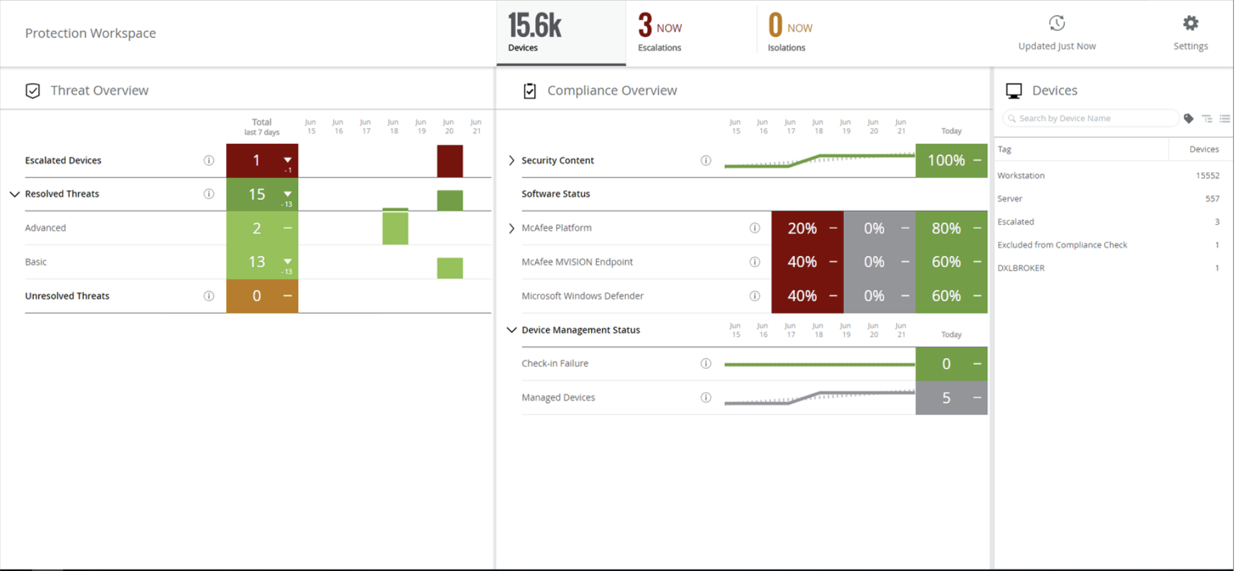
After getting to know our own customers, I proposed we flip our flagship product’s dashboard in favor of a compliance-based approach: namely, are you running the most recent version of your security software? That’s how some of our most successful customers got ahead of the torrent of alerts without cheating: first, make sure that all your endpoints—the devices on your network, from fat servers to wafer-thin laptops—run the most current threat software with the most recent threat models. For various reasons, a vendor’s updating processes can get gummed up for months if no one’s paying attention, which can result in machines being exposed to and exploited by threats to which their peers were essentially invulnerable. By prioritizing software compliance, threats that you do see should be real, actionable threats, and there should be vastly fewer of them.
Very quickly—by our definition; around half a year—we reimagined the user experience of our flagship product for compliance alongside threat-monitoring, while providing automatic enforcement tools for both. As our other security offerings integrated into our platform’s new model, we shifted from many tens of different contexts across four or more different logins, each with their own UX, to one login on one console and two contexts: a summary view and a drill-down into details. The detail view would encourage admins to push deployments of the newest security packages, bringing the host into compliance. The most important function required no effort from the user at all: automatic isolation of endpoints that may have been exploited, preventing the threat’s lateral spread to other internal hosts.


The result: many fewer threat events, and more time and attention to focus on the ones that weren’t automatically blocked. The best part: our new UX solution required little in the way of new engineering at any kind of scale. These grand new capabilities were things our system could already do if you knew how to pull the right levers. We were curious and humble enough to learn from our most successful customers and roll their strategies out to everyone else.
Ultimately, an experience must meet its intended goals. But you must choose the proper goals. We were lucky, in this case. The cost to have your product’s UX fulfill its purpose by way of reimagined goals will generally add up to a sum greater than any sane executive would pay. We had a richly flexible platform on which nimble engineers could build, as well as unusually risk-tolerant executives whose top-down support made all the difference.
Context
Context, in its most basic form—the “what” and “why” of an issue—is crucial to a human making the call between “ignore this” and “jump on this now.”
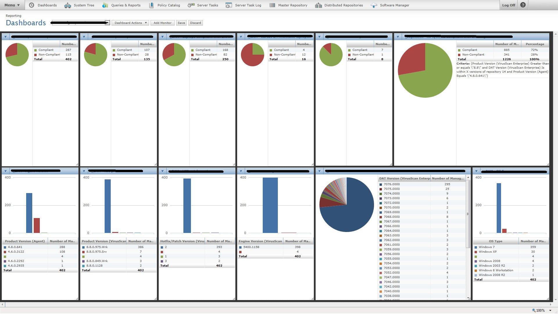
A top-level dashboard for one popular product had a pie chart showing the total number of events for the day, by criticality. Most of it was green, with a hefty wedge of yellow for unclassified security events and a sliver of red. Because the red changed so little from one day to another, one customer assumed all was well. They overlooked a huge spike in malicious (red) events because the outbreak also caused an enormous spike in innocuous (green) events, keeping ratios between the two the same.
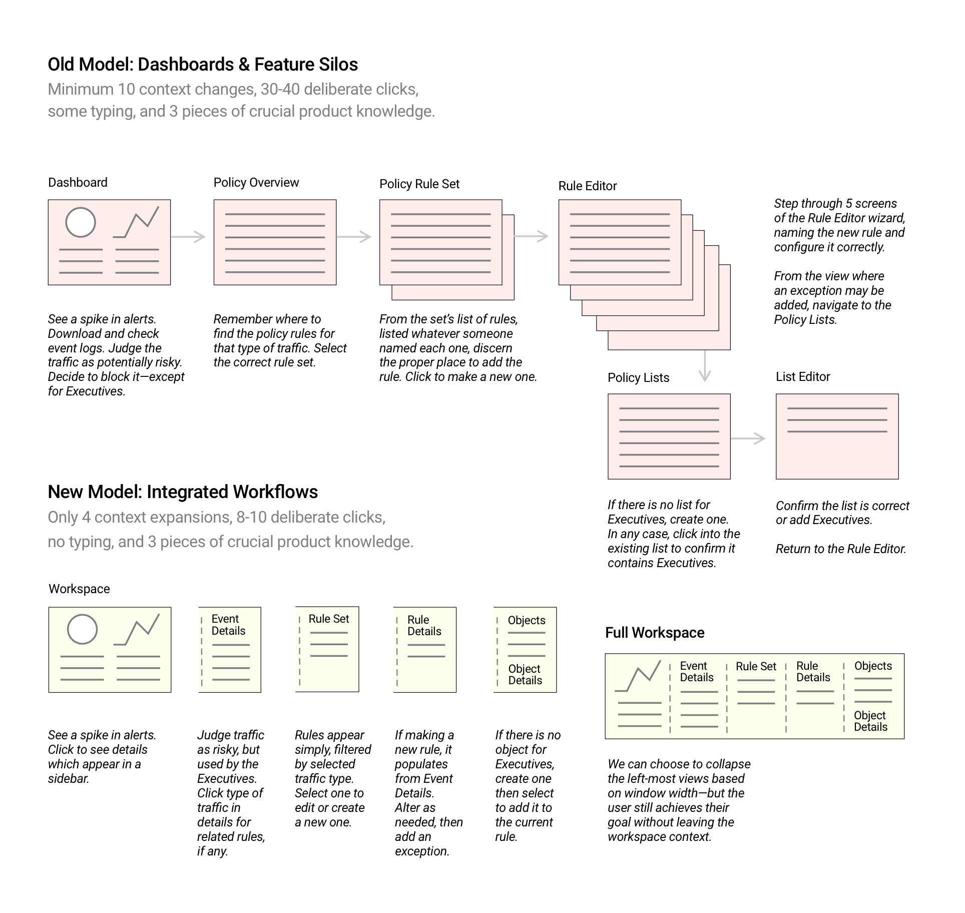
The best kind of context takes something moderately functional and makes it fascinating. I took hundreds of screens from our most popular product’s policy editor and origami’ed it into One Screen to Rule Them All, in terms of that one specific class of policy. When I showed the design proposal to customers, they nodded quietly and asked how soon it would ship.

Efficiency
There are many ways to make workflows more efficient, though I tend to focus on the larger labels of Assistance and Protection.
Assist the user in understanding why something has happened, then boost their overall efficiency by letting them close a loop in a workflow without leaving the current context.
If some annoying false-positive events are spamming your security console’s dashboard, you’d want to dial them down to make it more likely you’ll more quickly see events of real interest. But when you have to fumble through a series of menus to get to the setting that needs editing, you may no longer be confident about what exactly needs to change in order to silence those errant alerts. It would be super efficient to let people call up the view for the spammy event’s settings without leaving the dashboard. Then your eye simply needs to dart between two panels side-by-side in order to confidently make the right change.
Don’t prioritise screen tidiness by hiding “garbage” or “not human-readable” fields if customers depend on them. Let the drive for efficiency prioritise the work to present relevant information and controls in the same larger context.
It should be an easy sell to protect users by respecting their time—and one of the most impactful ways to do that is by respecting their cognition. Protection from unnecessary context switching is one of the most straightforward and valuable uplifts you can provide.
Presentation
The presentation of an experience is usually considered to cover styles, branding, and other aesthetic concerns. All too often, the product owners already have some idea of what information they’d like to present from the start of the project, and simply want a designer to take some examples of the data they already intend to present, rendering it out in a way that can be implemented quickly.
While those are important drivers, they’re often best served by establishing a clear visual hierarchy. The viewer’s eye should be drawn from one area or element on the screen to another in order of importance. Importance to what? Early in the process, it’s hard to know for sure. That’s why holding off on major presentation decisions until now can pay off.
For example: Consider carefully how you sprinkle red and other colors or tones around your screens. It should make users more efficient in grasping the message delivered in your presentation design.
Every view on screen or on paper comes with a visual hierarchy, whether it was intentionally designed to have one or not. Users will take something from it, even it’s not what was intended.
Inverting the usual direction in which these products are designed is the only way to break out of the negative feedback loop in which many product industries unwittingly find themselves. Driving the process from this perspective puts the focus on what truly makes users successful, increasing the odds of an organization’s success.
If we do not, cybersecurity products will continue to be more than simply expensive. They are likely to cost all of us dearly, in many different ways.


 Previous article
