Automated branding
At Container Solutions, we've been building Mesos Frameworks. All our frameworks can be found at mesosframeworks.com.
Besides the experience, this has brought us many interesting projects, like minimesos for testing, and Mesos Starter for quickly bootstrapping these frameworks. This means it’s now much easier than before to create your own frameworks.
Branding these frameworks is very important to us. We want them to have a website, a logo, blog posts, the works. Our design partner remember to play was faced with a challenge.
Marta Marszal from remember to play:
“At remember to play this project made us face a very interesting challenge. It was clear that CS would release multiple Mesos Frameworks within a short time, but it was unclear when exactly that would be and which frameworks there will be… so how could we design branding without knowing what we’re designing for? We decided to develop a branding system, which would allow us to quickly react to CS’ demand. The system included a logo generator and a template for the design and implementation of mini-websites. We wanted the new logos to be in the same family as the Mesos "mother" logo, so they're recognisable but not the same. This will help developers to mentally group projects together. We started by exploring the triangular grid. After several experiments we decided for the following idea: Use the Mesos logo triangular grid as our base shape Create a library of base shapes, which would be made out of 6-10 triangles Generate logos by overlapping two base shapes and blending their colours.
Once we started our collaboration with CS and worked on the implementation of the logo generator the idea required more tweaking. Together with Remmelt we managed to find the right solutions and arrive at a functional AND aesthetically pleasing solution.”
Implementation
This seemed like an interesting puzzle, and I had not done anything with SVG before, so I went in! There's a great scalable vector graphics tutorial on MDN. After going through it, I felt like this shouldn't take a lot of time.
General shape
The first challenge was to get the general shape of the logo right. I tried to draw single lines to make up the hexagonal shape but didn't get very far with that, it seemed like a dead end. After studying the hexagon some more, it finally dawned on me that it was built up of equilateral triangles. I guess it's like one of those pictures where you either see a vase or two faces. This was good progress because it's easy to draw a bunch of triangles in SVG using the polygon feature, and these shapes can each have a fill colour, so I wouldn't have to tackle that problem separately. My only fear was that the triangles wouldn't overlap nicely on the edges. After some testing it turned out that they do.
Having coloured triangles is great because with javascript we can just set the colour of the already drawn triangles, without having to draw the shape itself. Onwards!
I found a couple of promising javascript SVG libraries on Github, like svgjs and snap svg. Great tools but for my purposes definitely overkill. I only need to draw polygons, nothing fancy. I stuck to the browser's native SVG support.
I needed to find the coordinates of the top of the logo, based on the length of the sides of each triangle. Let's call this length n. The x of the top most point will then be x = sin(α) * n * 2. I'll leave it to you to figure out the rest of the equations.
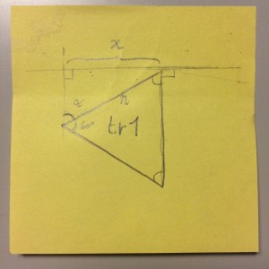
I decided to start drawing triangles from the top of the logo, sloping down and to the left. All triangles have an id so I can address them later. Now it was basic trigonometry to find the coordinates of the triangles.
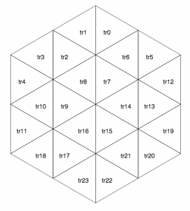
This is starting to look good!
Colours
The first iterations had totally random but connected shapes, with random colours and a 50% blend on overlapping triangles. Fun, but not always pleasing to the eye. You can see how that looked in this commit: 3cdc27c. It was clear that we wanted to have more control over how the logo looked. We decided to choose two different shapes from a shape library and the shapes should have at least two overlapping triangles. Colours come from a pre-chosen palette.
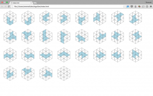
I was ready to choose a pragmatic solution, so I created the shape library by hand. The shape library is nothing more than a two-dimensional array with integers corresponding to the triangles' ids. This was kind of boring which increases the chance of human error. For this reason I created a separate commit where all the shapes are drawn next to each other for visual inspection.
Inspecting the shapes:
Blending Colours
At first we wanted to "multiply" the overlapping colours, which amounts to (red * red) / 256, repeat for green and blue. This results in more or less the same blend colour as "multiply" in Adobe products. It was decided that the blend colours were too dark.
In the end the blend colour is the midpoint between each colour component: (red + red) / 2, which in most colour combinations on the chosen palette turns into a nice and light blend.
Conclusion
You can view the result of this experiment in automating brand design over at logogenerator.mesosframeworks.com. This was a fun project that reminded me of my high school trigonometry classes and taught me the basics of SVG in the browser. It enables us to create logos and websites for new mesos frameworks with ease, speed and the certainty that they will look awesome! As a result this gives us competitive advantage in a market where speed and quality are required, but difficult to deliver.
Of course I attached the logo generator to the Wheel of Fortune for our Friday afternoon demo! We welcome other Mesos framework creators to pick a logo. Give the generator a spin!


 Previous article
